How to Do Data Visualization in Your Essays
Last updated: July 2020
How to do data visualization in essays:
- Try flash spatial.
- Remember of maps.
- Create videos.
- Record vox pops.
- Draw an expressive design chart.
- Consider interactive charts, too.
- Make GIFs to illustrate street views/panoramas.
- Create infographics.
- Try data visualization software.
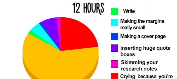
What picture do you imagine when hearing of data visualization?
Here is ours:
Source: Bored Panda
Yes, it’s a pie chart, a pictorial representation of numerical data. Perfect for visualizing your research papers, right?
Not really.
Today, when people don’t read but scan, the world goes crazy over videos and podcasts, and interactive content runs the show, data visualization goes far beyond pie charts, graphs, and diagrams. It takes so many forms that they even have a special course for it in colleges now! Students don’t just write essays; they write visual essays and think of creative ways to represent their research to professors.
No wonder:
Proper visualization is the best way to make your research papers stand out. When illustrating a content asset by visuals, you increase its view rate by 94% and produce 180%
more engagement, which multiplies its chances to get shared and remembered.
(Okay, when a student, you hardly think of likes and shares. But what about impressing a teacher and, finally, getting that damned and so desired A+, huh?)
Studies don’t lie:

So, Why and When Use Data Visualization
Visuals are a new way to communicate information and make it easier for users to perceive. When you create a graphic essay or write a long read for your blog, visual elements are perfect to represent data because otherwise it would take many pages to convey.
More than that, people respond to visual content better. Reasons are many:
- The brain processes visual information 60,000 faster than text. (While it takes about 1/4 second to process a symbol meaning, it takes about 6 seconds to read 20 words.)
- Ideas presented graphically are easier to comprehend and remember than those presented as words.
- 65 percent of the population are visual learners.
That’s why all bloggers and marketing specialists focus on data visualization in research articles for more reads, shares, and sales. Video is on its rise, interactive content (surveys, quizzes, calculators, infographics, e-books, emails) call the shots, and all they boost engagement, increase brand loyalty, and help marketers capture more data for their research.
“Hey, I’m a student, okay? What’s in there for my essay writing? Do all these visual tricks meet academic requirements?”
Yes, they do.
Most handbooks on evaluating research papers count tables and diagrams as the “organization” criteria and give 20% of a total grade for them. “Content originality” brings another 30%. Therefore, if you decide to do data visualization in essays – you can get half of your paper grade in one go!
The only detail to know is the proper places for visuals in your paper. Two options to consider:
1) Within your essay, just after the reference to a visual.
Like here:
Or here:
And remember of citing and referencing your visuals! This and this document will help you learn how to place visual data in the text of your essay, how to relate visuals to your writing, and how to create a caption.
2) At the end of your essay, after the list of references.
Known as the appendix, it’s a separate page at the end of your paper, including the additional information for readers. You can put visuals with corresponding captions there.
If you have multiple items to include, create a separate appendix for each visual. Don’t forget to format it according to essay standards (APA, MLA, etc.)
The first mentioned is the most common way to use visuals in essays. But whatever option you choose, be consistent: there’s no need to place images or graphs both in the text and appendixes. Follow the instructions your teachers give, or just choose one option and keep to it.
And now, for the most interesting part:
Visual Essays
They are quite a different story.
To define visual essay, let’s make it clear: it’s a set of pictures/other visual elements you use instead of words to complete a writing assignment. As a rule, it’s a mix of visuals and short written passages explaining what happens in your visual content.
Important!
Images you use to write visual essays should be original, i.e., made by you. (Keep on reading to find out what tools to use for data visualization.)
Here goes a terrific example, “Who cares about the forest?” by Franke James):
He combined photos, illustrations, and writing in 20+ visuals to craft an essay on the red hot issue of deforestation and its influence on our planet. Storytelling is not about words only, huh?
The best visual essays include:
- A short introduction, with hooks and thesis statement.
- A sequence of visual elements, related to each other and set consistently.
- A short analysis of each visual element, explaining what’s in there.
- Conclusion. (Yes, short again.)
An average visual essay consists of 10-12 visuals and 500-700 words of the accompanying text, formatted in Word Doc or PDF. When teachers give you a graphic essay assignment, they’ll evaluate your critical thinking, presentation skills, cultural competence, and ability to convey arguments and facts in graphic form.
Writing visual essays, you stimulate creativity, attention, memory, and analytical skills.
Want to get a better idea on how to create a graphic essay? Let us know in comments, and we’ll craft an ultimate guide on visual essay writing here on Bid4Papers blog. 🙂
What Essay Elements to Visualize
Together with “how to write essays with visuals,” content creators often ask what exact elements to visualize and how to know if a particular method is relevant to their topic or niche.
Here’s how you solve this:
First, consider the audience.
If you are a student writing essays for teachers, everything will depend on many factors: a subject, a format (printed or online), and other specific requirements your teacher gives.
- For Geography-related majors, research papers require at least one map. Make it interactive et voilà, it brings engagement.
- For Business and Management, Marketing and Data Science specialties, statistics presentation is a crucial skill that will get you extra points. Get wild with the charts, and you can do so much better than that old boring pie.
- History papers “tell the story” with data. GIFs are perfect for illustrating timelines in just one pic.
- English and Literature will rock if you support the text with visual features. For example, if writing an essay about Dickens – create a collage with that-era bookshelf and add pop-up descriptions of each book cover.
If a digital copywriter or marketer, think of a specific visual presentation format that would engage your audience most. Consider a platform where you’ll land it: is it a blog post, your landing page, a YouTube channel, cold email, or slideshow presentation at a conference?
Two questions to answer:
- How can this visual best appeal to my audience in this specific setting?
- What is the simplest method for displaying this data? Which one will represent my information better? What data do I need to highlight most?
And second, rely on these criteria when deciding what argument or fact to visualize:
- Is it exciting? – Boring topics will rarely benefit from visual adaptation.
- Is it complex? – Copybook maxims don’t need visualization.
- Does it spark a discussion? – If it’s unequivocal evidence, then it’s not worth the effort.
But when it’s not a fact of common knowledge, and you understand it’s worth visualizing, the question arises as to what option and tool to choose for it.
How to Do Data Visualization in Essays and Other Content
When you write visual essays or create content assets for marketing goals, forget about ready-made templates. They are boring. And big chances are, your peers or competitors have used them already.
Be creative, design visuals on your own! Data visualization tools are many, and the most common ones are:
- Adobe Flash
- Photoshop
- Windows Movie Maker
- PowerPoint
- Microsoft Word
- Imovie
But if your ambitions go beyond diagrams, charts, and infographics, here go alternative options on how to visualize data.
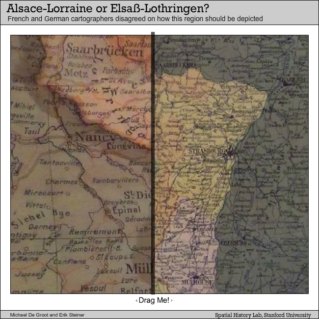
1. Flash spatial
Perfect for Geography, History, Politics, or Social Sciences papers. If you have any map-based data, overlap two pictures and let the reader compare them by moving the slider back and forth. A small step from spatial comparison, yet far more engaging and impressive.
Example:
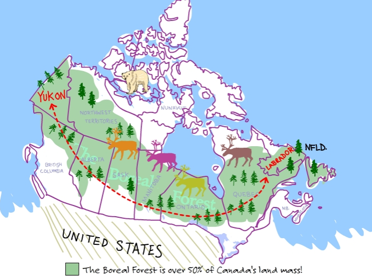
2. Maps
Carto is a terrific tool for making amazing interactive maps. Leaflet is another one. Location-related facts will help to illustrate any scientific research. Gather the metrics and build up a visible backdrop for your thesis.
Example:
3. Videos
Nothing says “I gave a major damn about this research” like a video file in your professor’s inbox. Presenting your research in a 3-minute speech is the best way to sift through the backbone facts and wrap them in the perfect form. Don’t overlook the screen recording option!
Example:
And another one:
4. Vox Pops
The favorite tool of many marketers, it works best with a study involving people and opinions.
Record your respondents in their natural habitat or via Skype and edit into a convincing illustrative interview to support your thesis. Choose between “audience opinion” vs. “expert’s opinion,” depending on your subject.
Check the examples of non-video vox pops here.
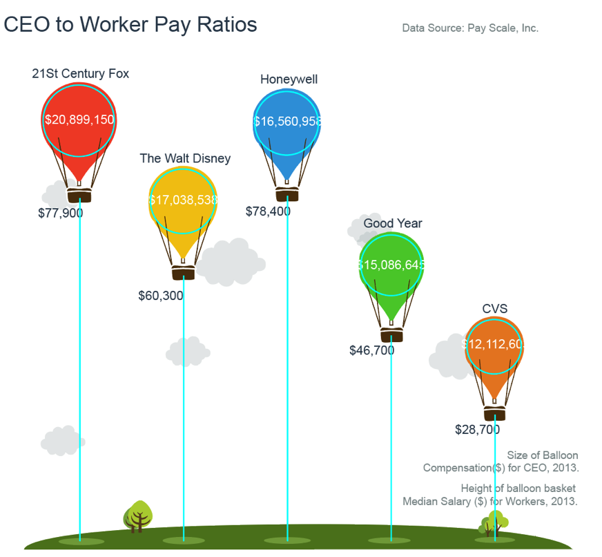
5. Expressive Design Charts
Stuck with charts to state your theses in Business and Management and related disciplines? Thy this trick: keep the chart but pimp it up in a creative way, so your paper will immediately stand out and get remembered.
Example:
6. Interactive Charts
Nothing gets your reader more engaged than the possibility of tailoring your research to them personally. With a 5-dollar-help from a freelance programmer, you can turn your data into a fun personalized illustration. Add some back-end work: gather the data from your professors or peers for further use.
Examples:
7. Street Views / Panoramas
Ten years from its launch, Google Street View has become a powerful tool for illustrating Geography and Communities research. You can use it to predict the city areas development over time, for example. Pull several layers in a timeline GIF to illustrate your findings.
Example:
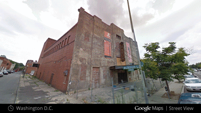
QUOTE: “It’s always nice when your research checks out with the view outside your window.” – Scott Duke Kominers, the Harvard Business School MBA Class of 1960 Associate Professor
8. Infographics
Infographics are a great help in learning because this content format requires you to summarize concepts and identify certain things as significant. It helps your professor to better evaluate your knowledge, too. A whole host of handy (and free) tools are out there to help you with the designs: Visual.ly, Tableau, Venngage, and Infogram are just several to mention.
NB: If you also need to promote the research among college communities or online, a comprehensive infographic increases your chances of getting noticed by far.
Examples of infographic templates: here and here.
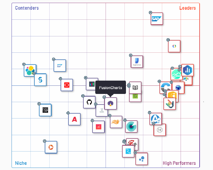
9. SaaS Data Visualization Software
Many businesses leverage data visualization tools through a SaaS subscription. These tools help organizations translate big data and their key metrics into digestible charts and graphics, helping them better understand how they’re tracking towards their goals.
But students, universities, professors, and other researchers can use these tools as well to create dashboards and turn big data/research sets into easy-to-interpret visualizations. Those looking to implement a tool such as these should look at online review sites to compare the over 200 data visualization software products on the market.
Examples of SaaS Data Visualization Software:
What Else Do You Need to Know?
If you choose to work on your data visualization with a freelancer, make sure not to leave it to the final day before submission. It’s time-consuming, so save yourself several wiggle days to input extra data as needed.
When creating a complex visualization, skim to just one per academic paper to avoid clutter.
One final piece of advice:
Don’t assume that data visualization is research – an essay maker should use data visualization as a cherry on the top of their impressive essay. Your paper still needs a strong hook, good thesis, and all the required chapters included to make it a delicious cake.
Sources: